Visual Identity System
![]()
![]()
![]()
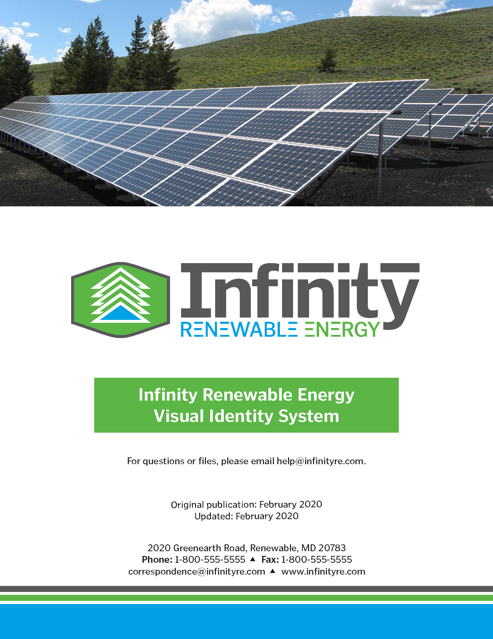
Infinity Renewable Energy (IRE) Visual Identity System
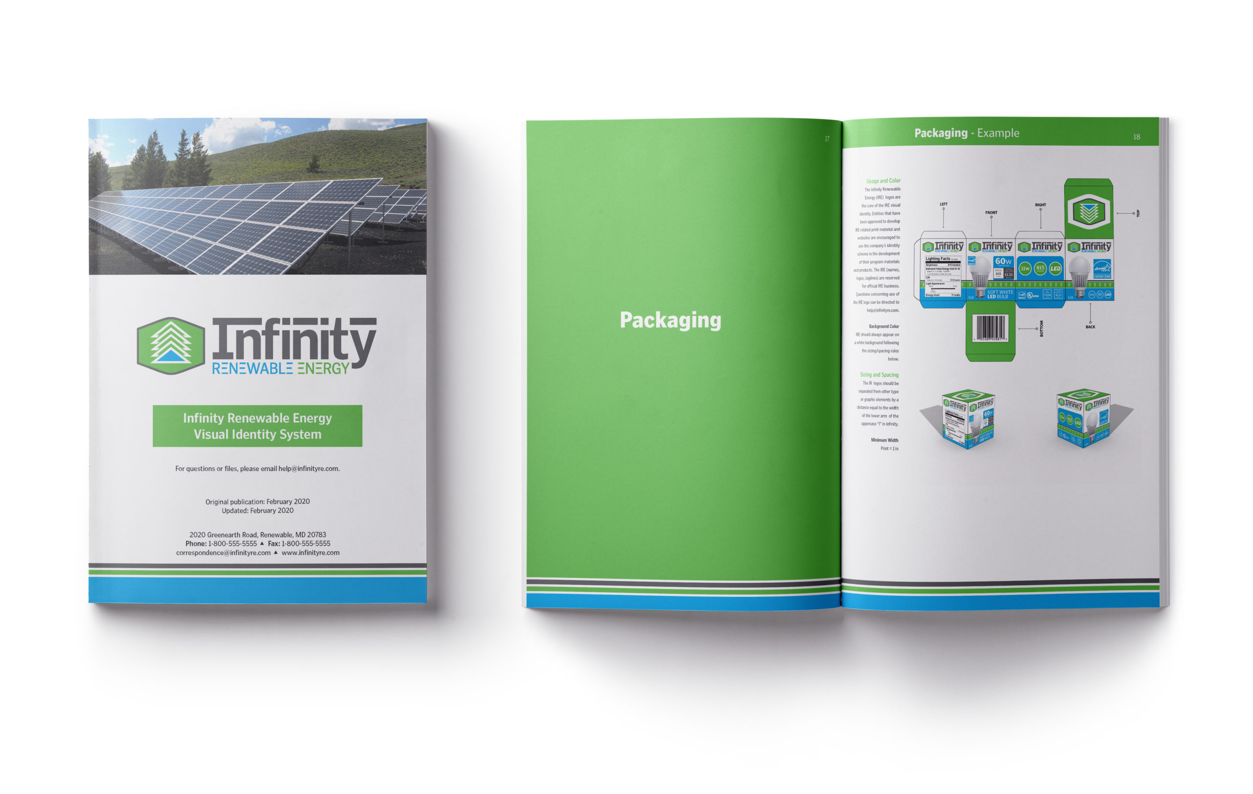
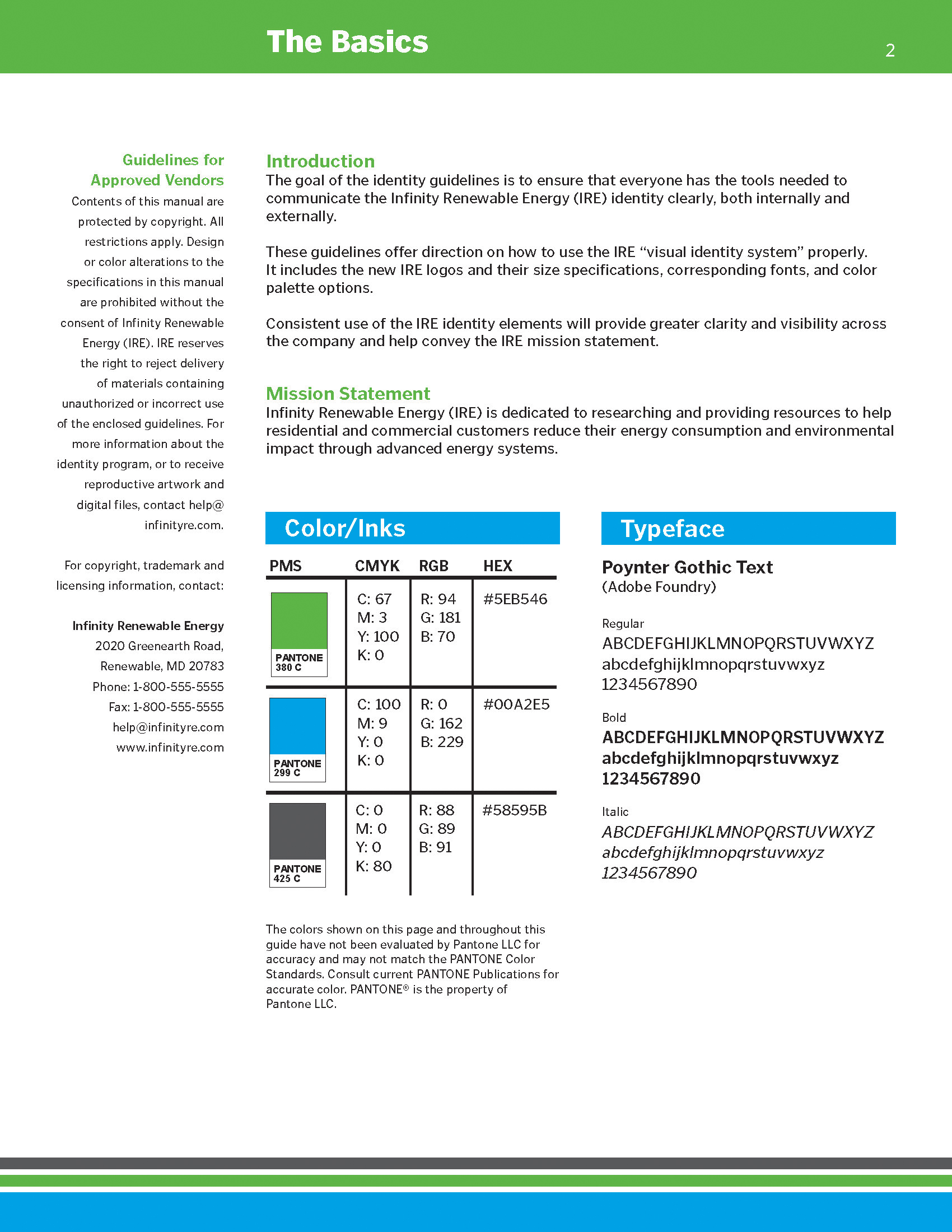
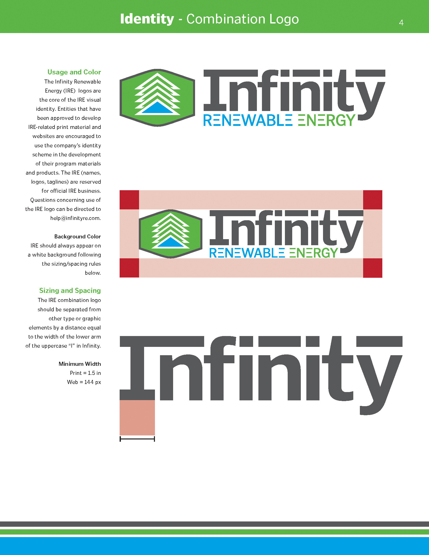
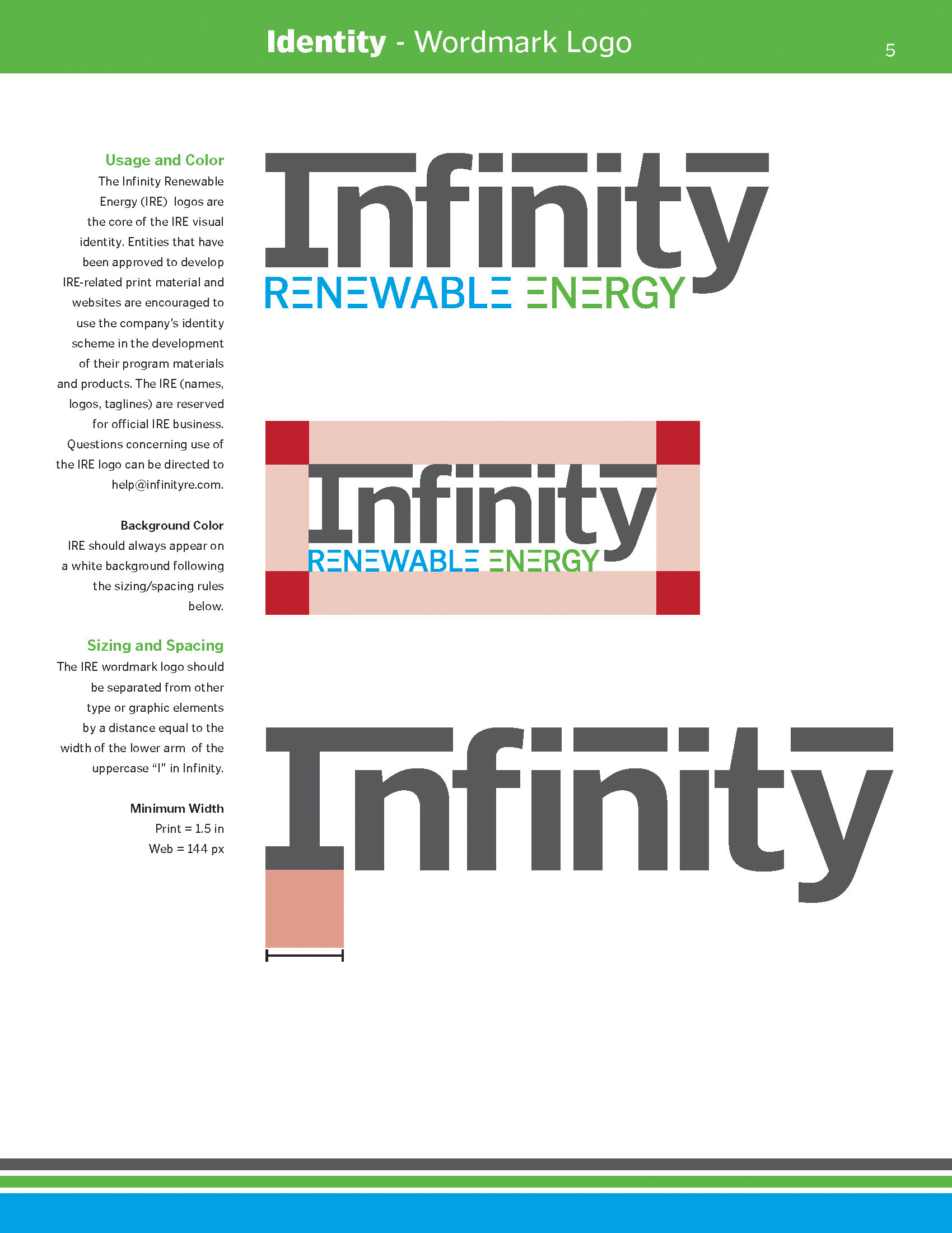
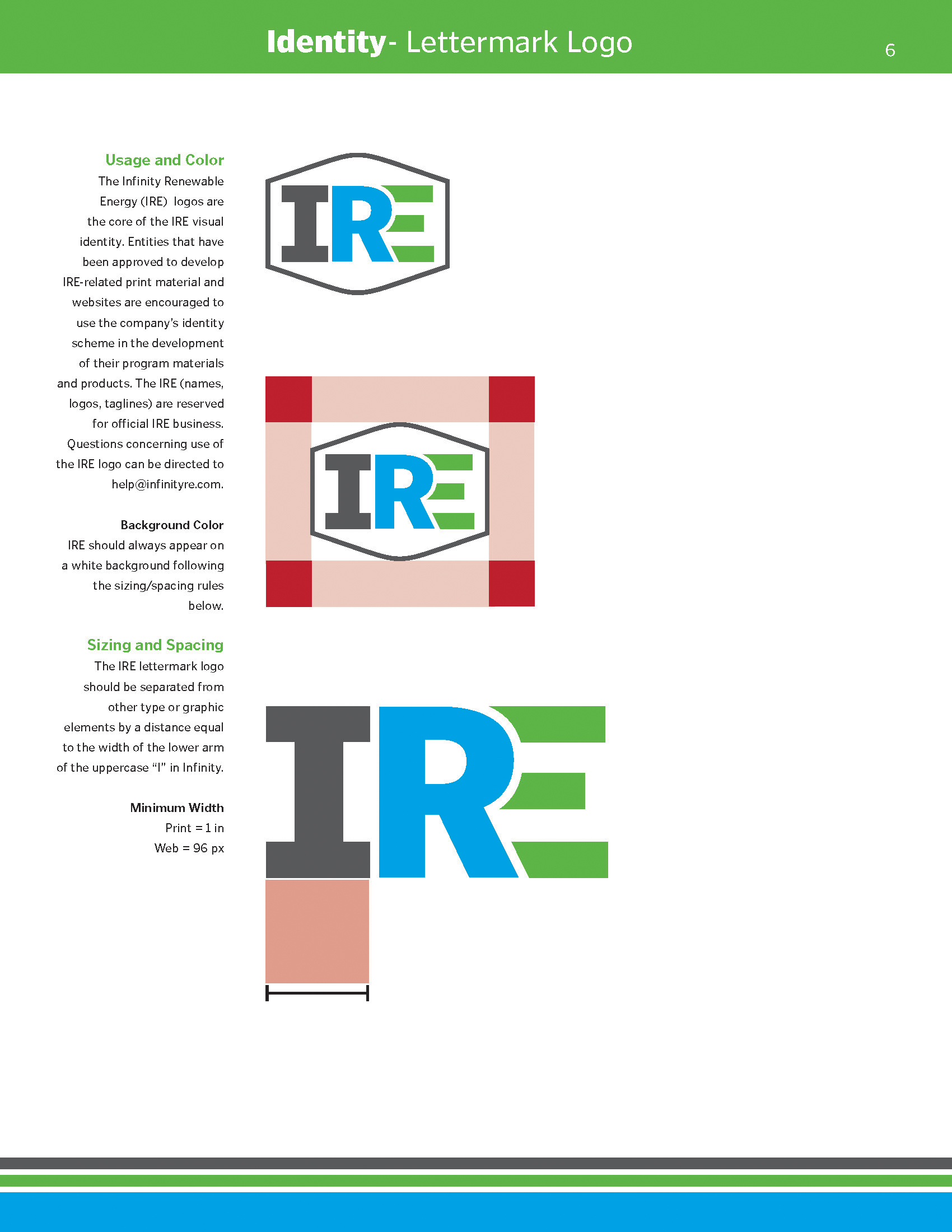
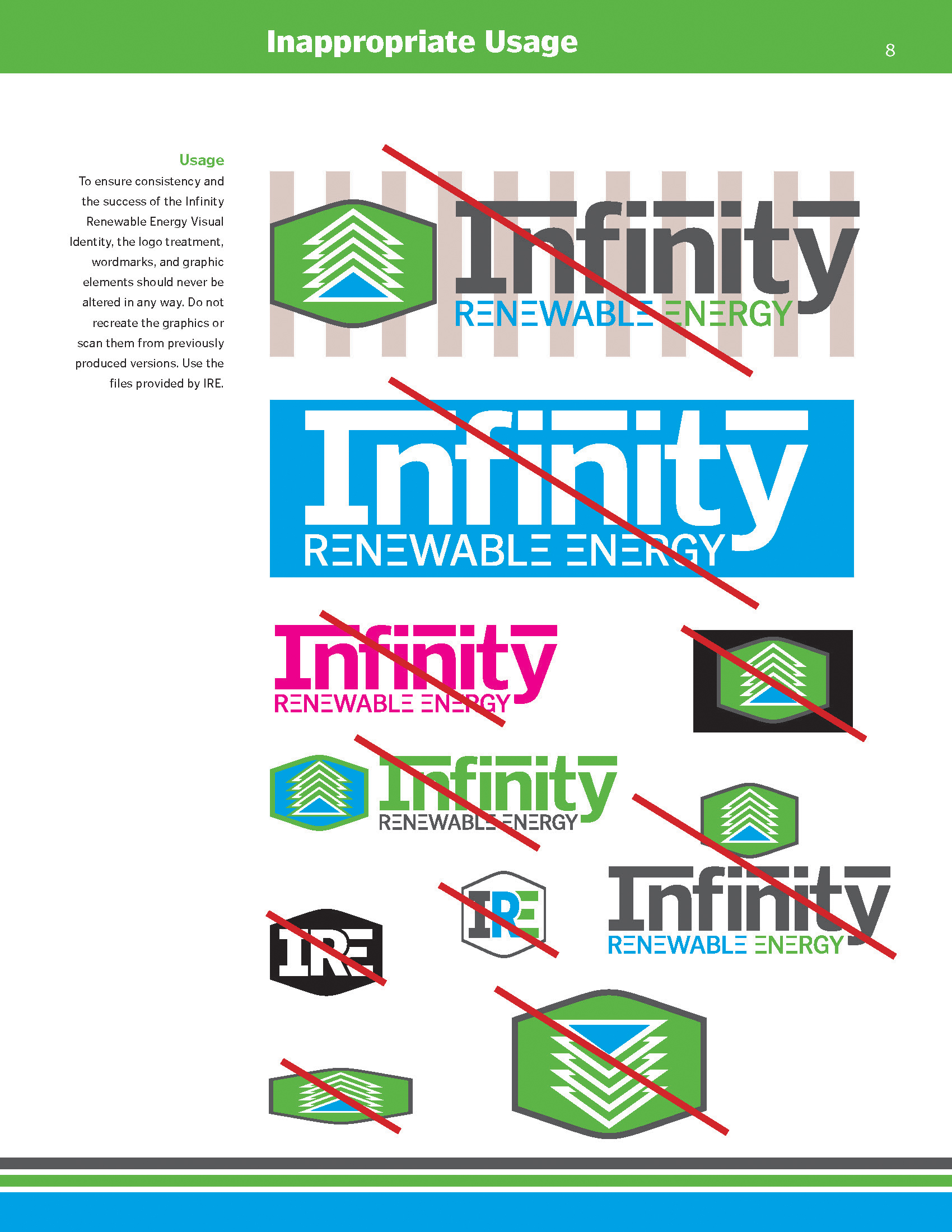
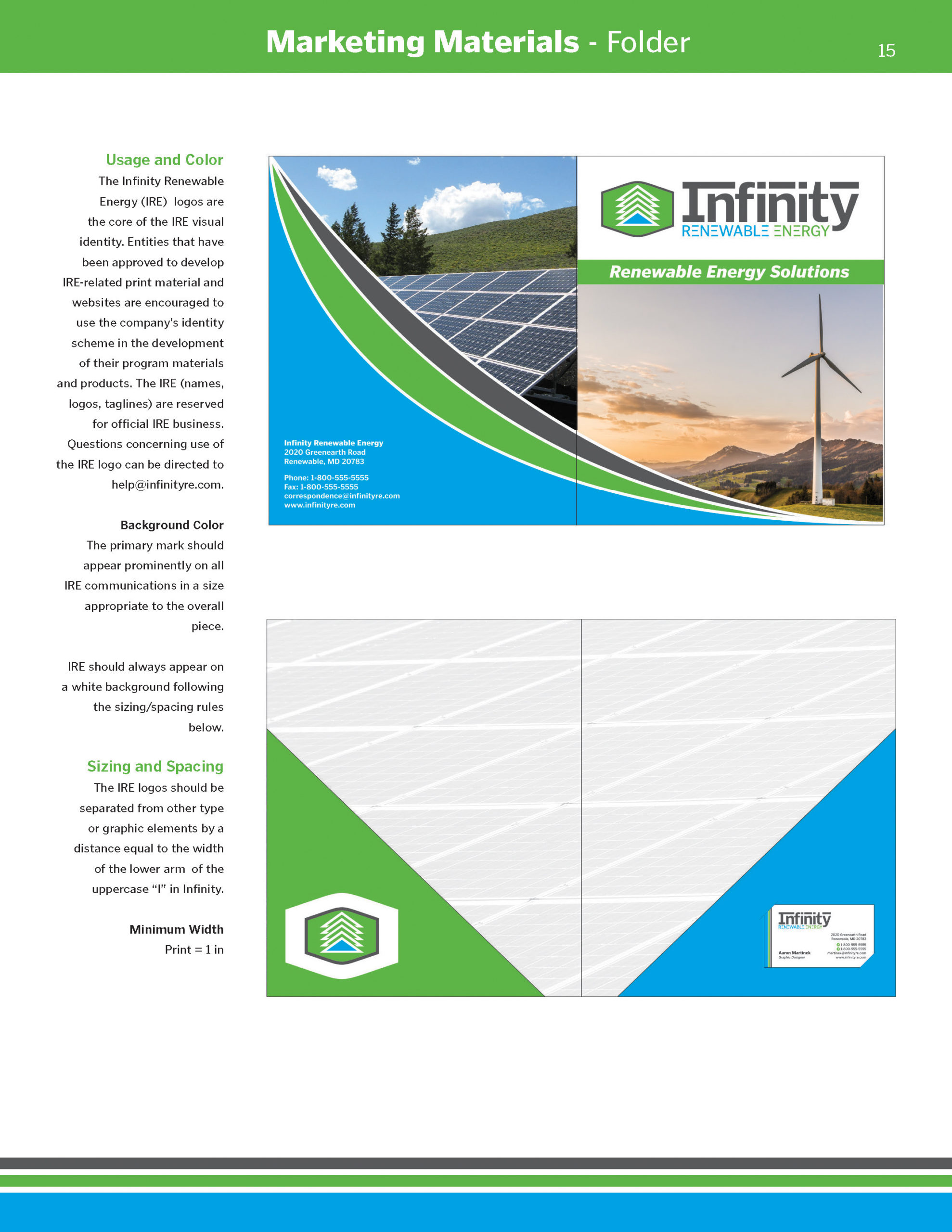
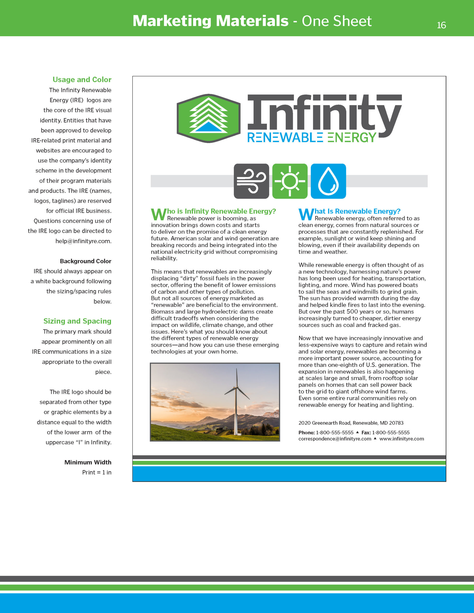
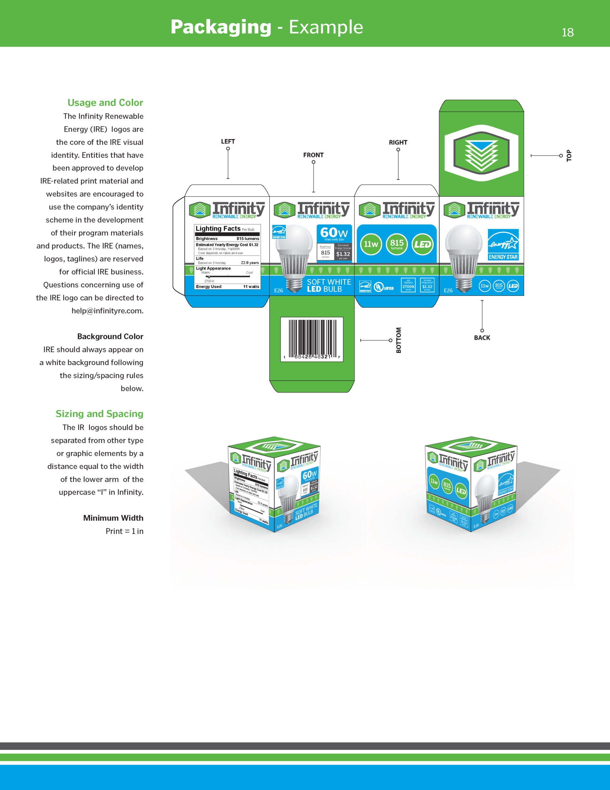
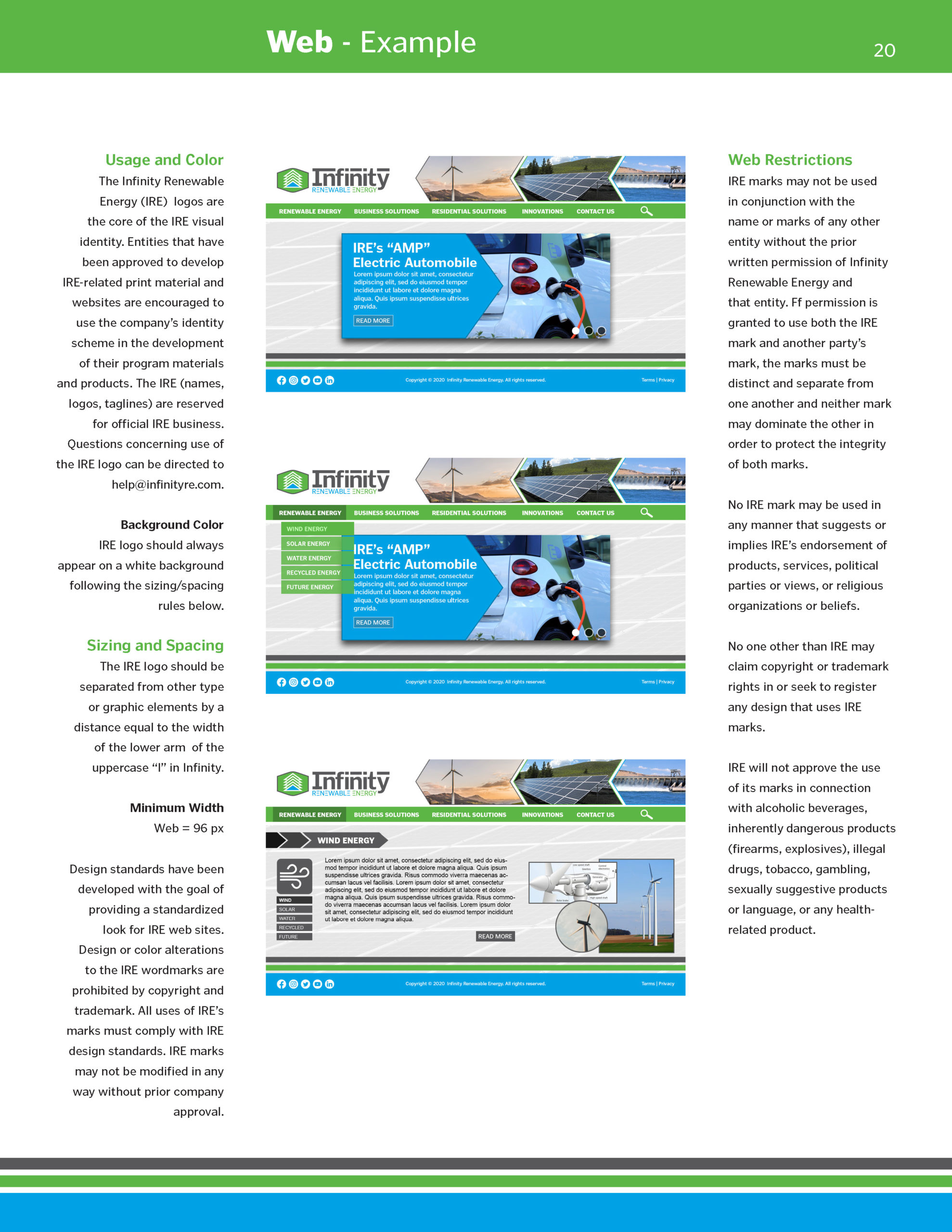
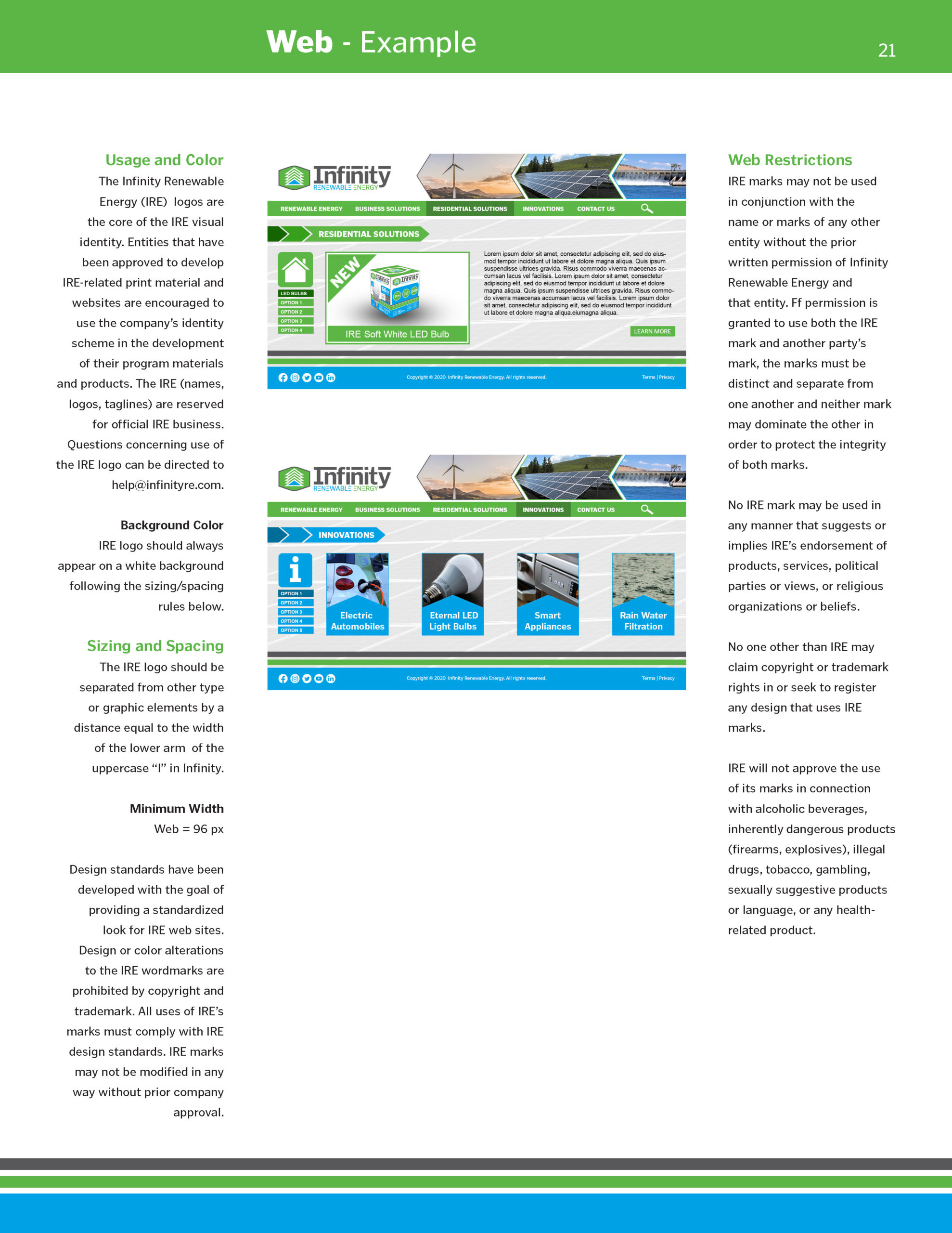
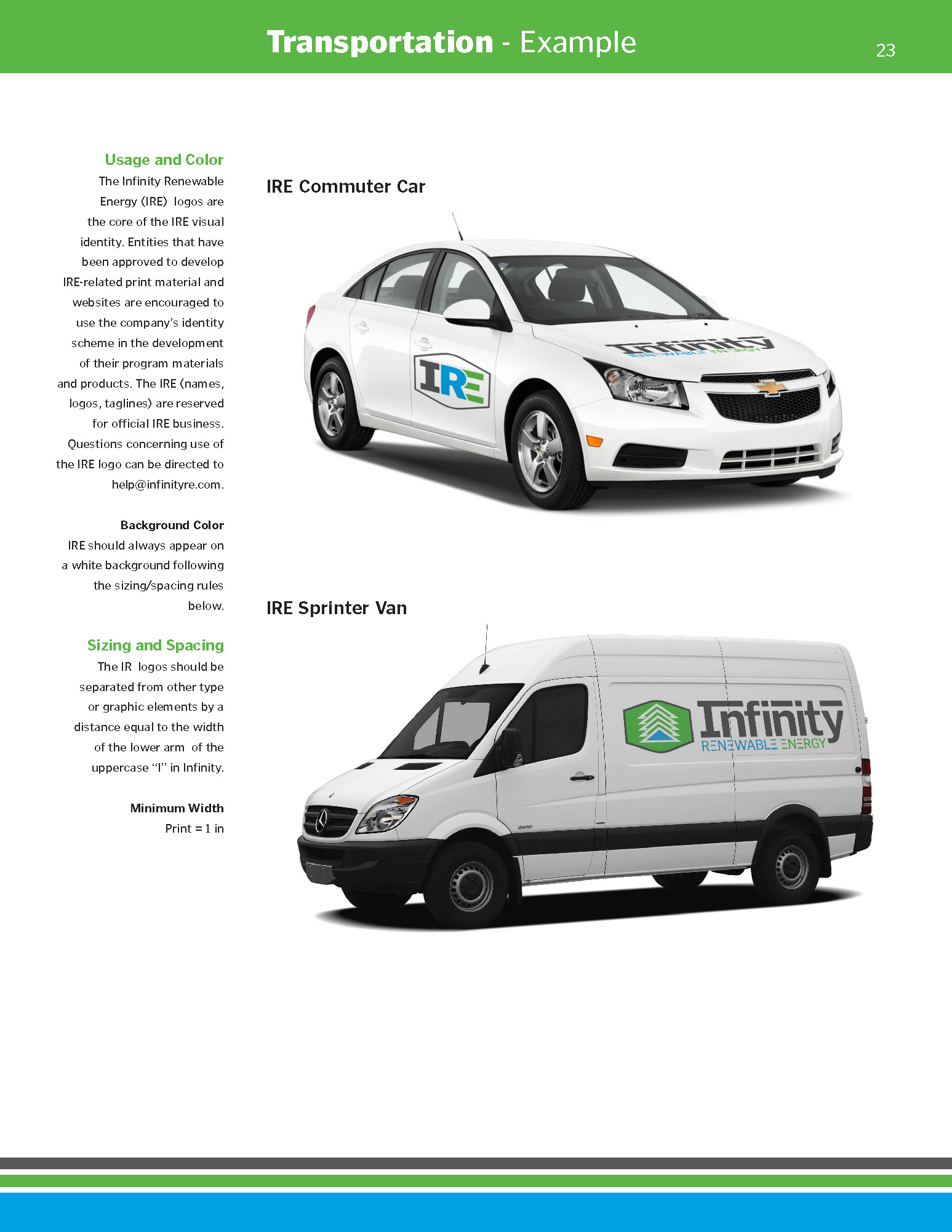
The objective was to develop a logo/brand for “Infinity Renewable Energy” (IRE), while adhering to their specific guidelines.
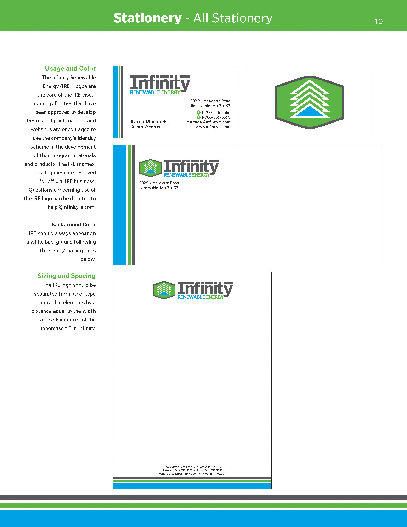
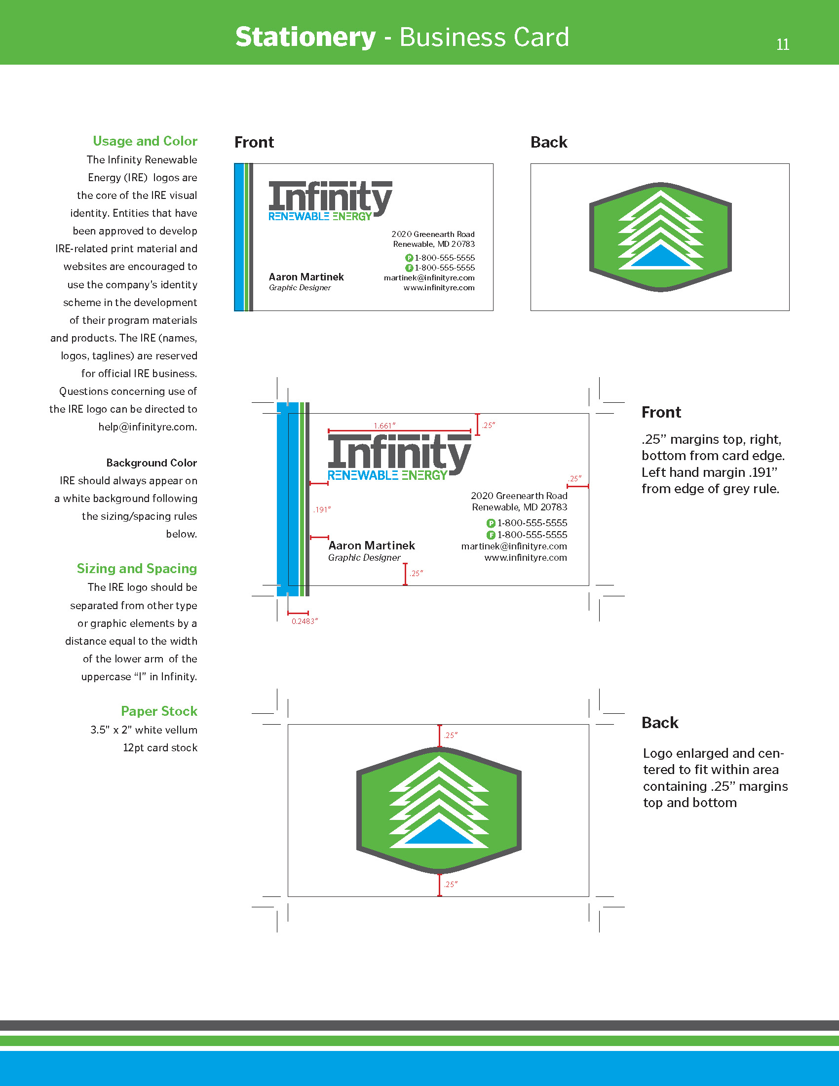
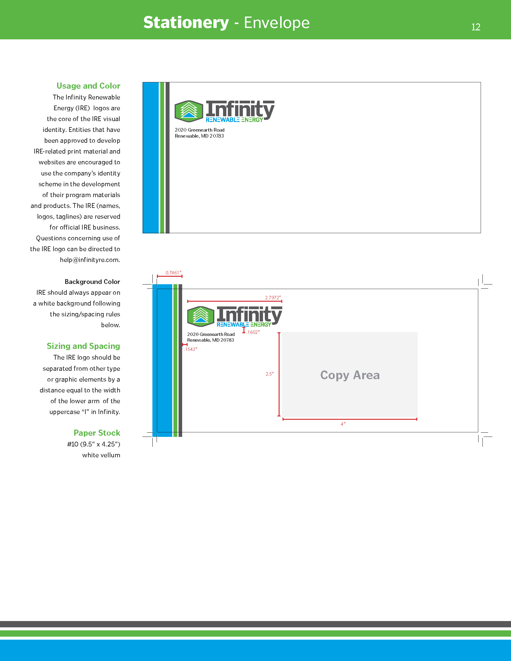
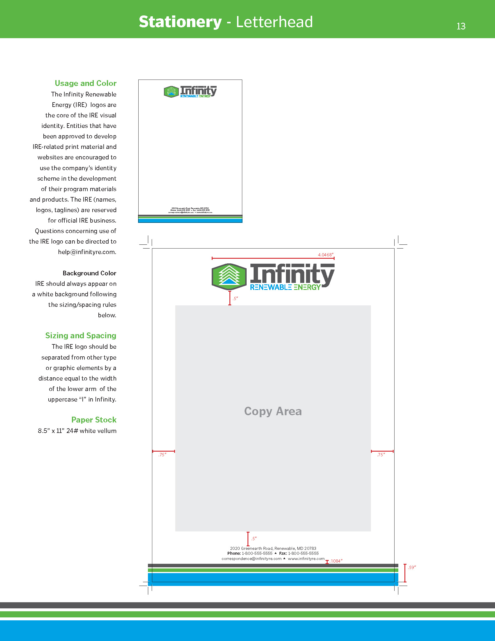
Upon completion and approval or the logo, a brand was created, and utilized for all aspects of IRE’s company. In the end, a Visual Identity System was created to include all information for the brand. The materials are used to educate the general public of IRE’s mission and specifics to renewable energy. In addition, the VIS will be used to IRE employees and partners to adhere to their brand guidelines. Illustrator, Photoshop, and InDesign were utilized throughout the process.
Notes from Client:
“We expect the logos to be unique, memorable, simple, elegant and communicative”.
Symbol Logo: “Consideration should be given, to evoke the expression of clean and renewable energy without being overly descriptive. An abstract image is preferred.” They insist “Do not use symbols or imagery that are easily identifiable such as infinity symbol, recycle symbol wind turbines, light bulbs, leaves, lightning bolts, plugs and other images that are commonly associated with electricity and renewable energy. No logo should resemble an already existing logo or a symbol.”
Furthermore, the client requires all logo designs to be “compact and inspired/derived by Gestalt principles and positive/negative spaces”. Also, the general impression of the logos must have a modern appearance.
The color palette should not exceed more than four colors for all the logos combined including the background color. (no gradations and transparent spaces). Must specify a single background color for all the logos.
